
Data Analysis with Python
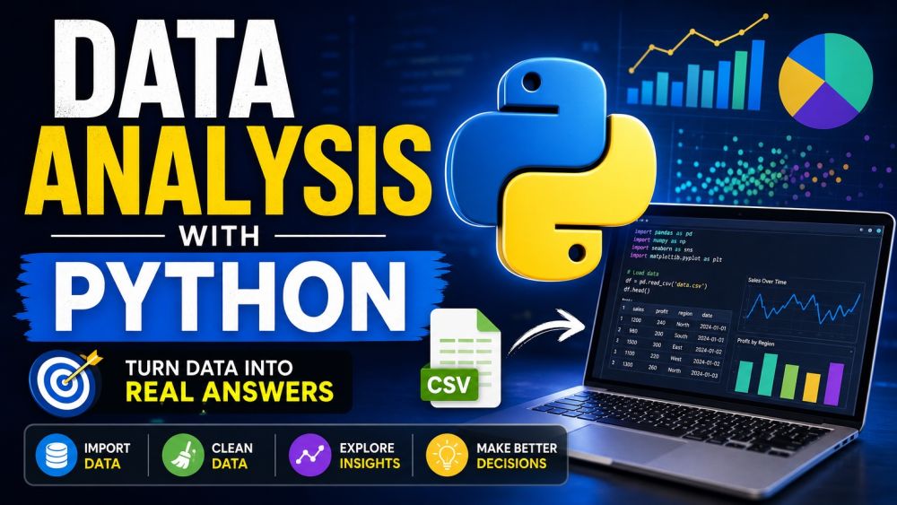
BeginnerData surrounds every decision today, but turning a spreadsheet or CSV file into a real answer takes more than opening Excel. This course teaches you to think and work like a data analyst using Python — the language powering most of the world's data work — from your very first line of code. No prior programming experience is required. You start with just enough Python to be dangerous: variables, lists, dictionaries, and loops, learned inside Jupyter notebooks the same way working analysts do. From there you move into pandas, the tool at the center of practical data analysis, learning to load real CSV files into DataFrames, select the columns you need, and filter rows down to exactly the data that matters. Real-world data is never clean, so you dedicate a full track to fixing it — handling missing values, correcting data types, removing duplicates, grouping data with groupby, and merging multiple tables into one coherent dataset. You then learn to see your data by building charts with matplotlib and seaborn, choosing the right chart for the question you are asking, and reading plots the way analysts do. Finally you tie it together with summary statistics, correlations, and aggregation, learning to draw a real insight from numbers and explain the story behind them. Every lesson is hands-on and example-driven, built around the everyday problems analysts actually face. By the end you will confidently load, clean, analyze, and visualize a dataset from scratch — and explain what it means.
Videos
See allTracks
You do not need to be a programmer to analyze data — you need just enough Python, and this track gives you exactly that. You start inside a Jupyter notebook, the same environment real analysts use daily, learning to run code cell by cell and see results instantly. You will store information in variables, group related values into lists and dictionaries, and use loops to repeat work automatically instead of by hand. Every concept is taught through small, practical examples rather than abstract theory. By the end you will read and write basic Python comfortably enough to start working with real datasets in the next track.
Pandas is the tool that turns Python into a real data analysis workhorse, and this track gets you working with it hands-on. You will learn the two core building blocks — the Series and the DataFrame — and load real CSV files straight into them, the same first step behind almost every data analysis project. From there you practice selecting exactly the columns you need and filtering rows down to the records that actually matter, using conditions the way analysts do every day. Instead of memorizing syntax in isolation, every lesson works with realistic datasets so the skills transfer directly. By the end you will comfortably load, explore, and slice real data with pandas.
Real data is messy, and knowing how to clean it is what separates a beginner from a working analyst — this track teaches exactly that. You will learn to find and handle missing values without silently corrupting your analysis, correct columns that hold the wrong data type, and remove duplicate rows that would otherwise skew your results. You will then learn groupby, one of the most powerful tools in pandas, to summarize data by category, and merging, to combine multiple tables into one coherent dataset the way real-world data almost always requires. Every technique is practiced on deliberately messy sample data so you build real troubleshooting instincts. By the end you will confidently turn raw, imperfect data into something trustworthy.
A table of numbers rarely speaks for itself — a good chart does, and this track teaches you to build one. You will start with matplotlib, Python's foundational plotting library, learning to create line, bar, and scatter charts and control the details that make a plot readable. You will then move to seaborn, which builds on matplotlib to create polished statistical charts with far less code. Along the way you learn how to choose the right chart type for the question you are asking — comparison, distribution, relationship, or trend — instead of defaulting to whatever chart is familiar. You will also practice reading plots critically, spotting what a chart reveals and what it hides. By the end you will turn raw numbers into visuals that communicate clearly.
This track is where analysis becomes insight — where numbers stop being just numbers and start answering real questions. You will learn to compute summary statistics like mean, median, and standard deviation to describe a dataset at a glance, and calculate correlations to see how variables move together. You will use aggregation to roll detailed data up into meaningful summaries by group, category, or time period. Most importantly, you will practice the skill that separates data analysts from spreadsheet users: interpreting what the numbers actually mean and explaining the story behind them in plain language. Every lesson works through a real question end to end, from raw data to a clear conclusion. By the end you will confidently draw and communicate genuine insight from any dataset you are given.
Certification Exam
Certification Exam
Data Analysis with Python
All tracks · No time pressure to start
Certification Exam
Data Analysis with Python
30 Questions
All difficulty levels
45 Minutes
Auto-submits when time expires
70% to Pass
Earn your certification badge
No Going Back
Once you answer, you move forward
Tips
See alldescribe() Is Your First Stop for Any New Dataset
One line of summary statistics before you do anything else
Reading a Correlation Matrix Without Overinterpreting It
Correlation measures a linear relationship, not causation
groupby: Pandas Most Powerful Aggregation Tool
Split, apply, combine, in a single readable line
Choosing the Right Chart for Your Data
The wrong chart type hides the story instead of telling it